Jump Training
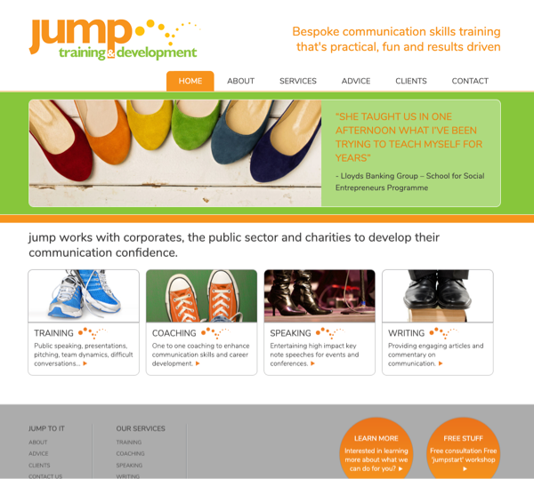 Jump provide communications training to commercial and charitable organisations, and they needed a bright and outgoing look. Fingermouse designed the current logo based on an existing colour scheme, which has been applied to the website and all printed material.
 The current logo is simple and easily recognised, and the circle theme is continued throughout many of the company's printed materials. The distinctive orange, yellow and green scheme is easily recognised by clients and helps to create a very clear brand identity.
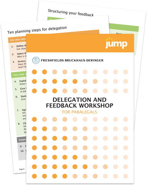 Fingermouse regularly produces professionally-printed workbooks for use in training sessions with various clients. Basic content and layout suggestions are provided by Jump, and Fingermouse turns them into final designs and typesets them for commercial printing presses. Workbooks can be between 12 and 30 pages long.
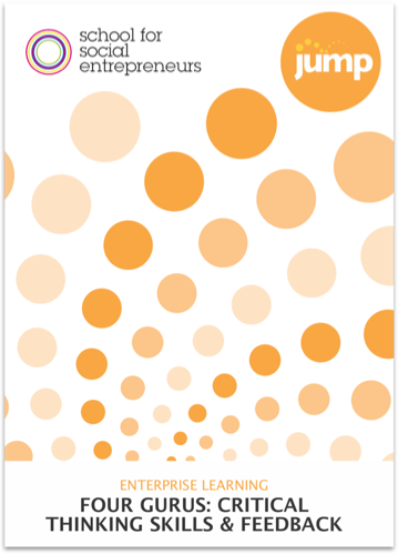 Various cover designs have been used for different clients, all based around Jump's circle theme. The placement of client logos on the cover is important so that the trainees can identify that this resource is provided specifically for them.
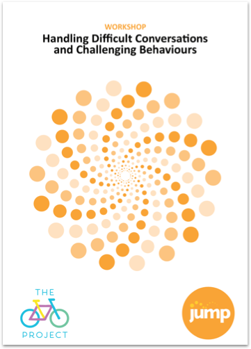 This is another circle cover layout, this time for The Bike Project. In this case, the circles are grouped to represent a wheel in motion, although most people probably just see it as an attractive pattern.
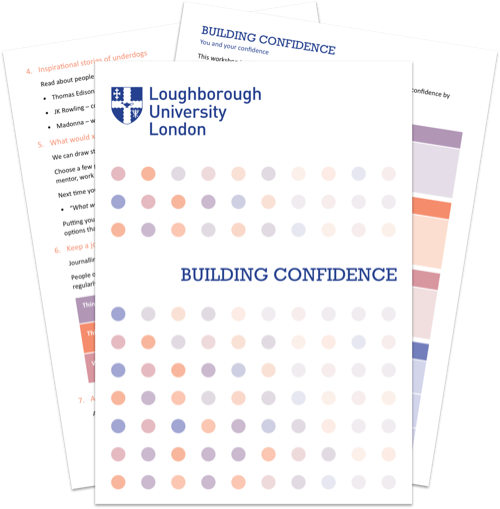 This collaboration with another organisation meant losing the Jump branding and working with a different colour scheme. Here the design has a more corporate feel as requested by Loughborough University London.
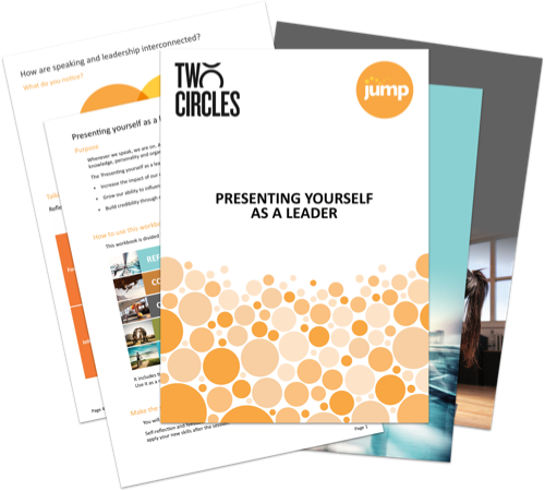 This workbook for sports data company Two Circles has a more upbeat feel and uses photographic imagery to identify different sections and bring the content to life. Stock images were sourced to match up with particular colours and ideas, and smoothly integrated into the layout.
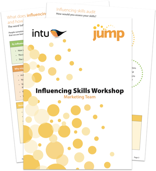 This workbook cover style has been the most-used and is on many materials for a range of clients across the country. This particular example shows a workbook for Intu, the shopping centre company.
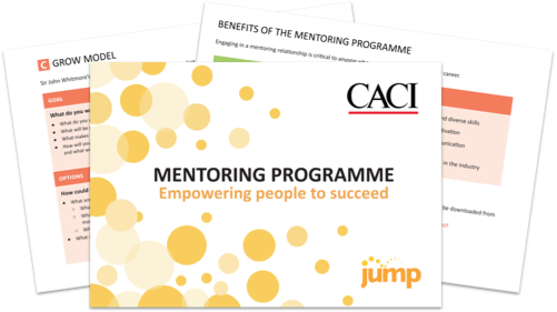 Workbooks aren't always in the same format. This workbook was produced for CACI in landscape A5 format (most books are A4), which presented unique design challenges but helped their training materials stand out.
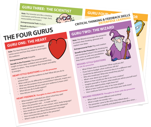 Fingermouse also works on other printed material for Jump, such as this four-panel 'Four Gurus' sheet. Fingermouse not only designed the layout and colour scheme but also drew the cartoon graphics from scratch to be used wherever the Four Gurus are mentioned.
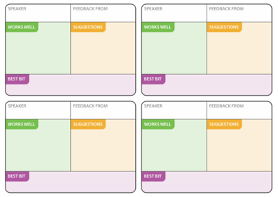 These simple feedback forms can be handed out at the end of sessions and are another example of small design elements where Fingermouse has provided a solution.