
Enabled2Parent
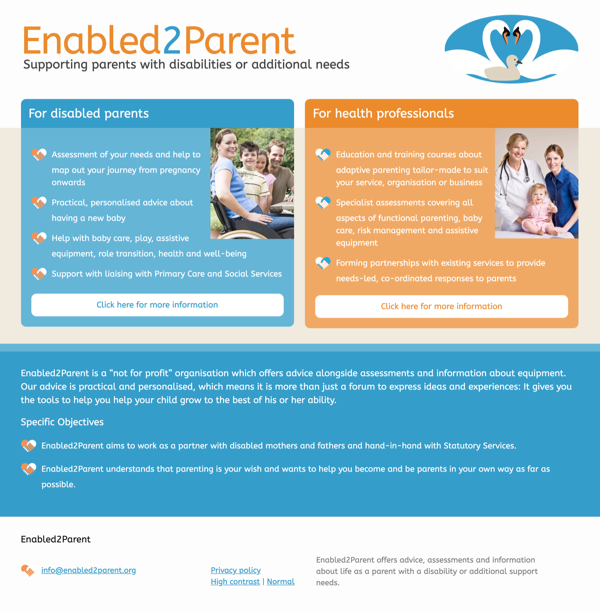 Enabled2Parent needed a website that was both clear and accessible. Fingermouse designed a site using the pre-determined orange and blue from the logo, along with various tints and a carefully designed layout to make it clear which area of the website a particular visitor should visit.
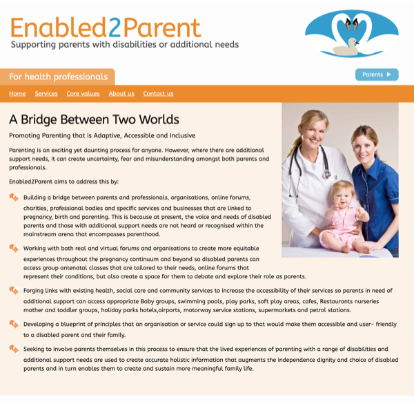 The orange area is designed for health professionals and contains advice and guidance for those in the health profession. The layout is designed so that it's always clear which area a user is in, and it also needs to be obvious how to get to the alternative section of the site.
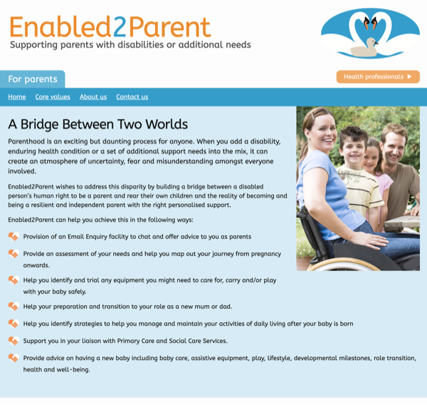 The blue area of the site is for disabled parents and features similar content but with a specific theme. The site was custom-built using Jekyll to allow minimum development overhead and basic editing via the host.
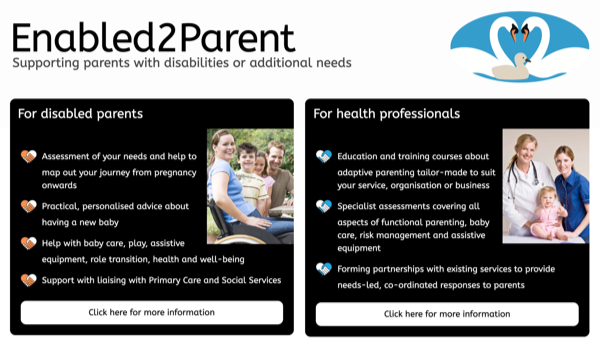 The site also features a high-contrast mode which can be enabled or disabled as required for visually impaired visitors. In this mode, black and white is used as much as possible and the contrast between elements is dramatically increased.